Wispy as a cloud

Do you know that every year, I make two bodies of work? I’ve done so since 2015 when I transitioned my practice from designer to artist. Each comprises between four and ten works. I never know for certain how many until the series simply feels complete.

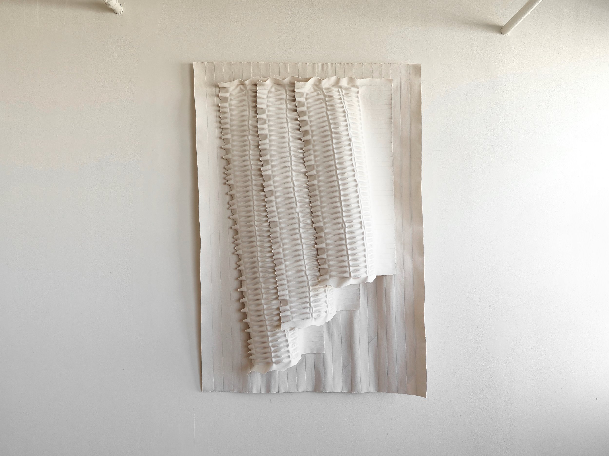
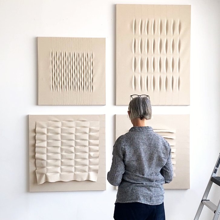
Earlier this year I completed a group of four editioned works, called Toile. They’re editions of 25 each, so once the 25th of each has been acquired, there’ll be no more. Toile has been on my website since March, and since I’m posting this on the last day of May, I am feeling an urgency to get absorbed in the second series of the year. I never find it easy getting started so I had better get going…

For this new series, I’m writing and sketching a lot. Normally I work well when I do neither, but recently I’ve been trying to understand better what motivates me and what I do. I am inspired by living with my work for a period after it’s finished. I've always done that and I'm doing it now. Once I understand what I want to explore,  I develop my ideas with technical studies in scale and proportion. These I then translate into paper patterns, followed by test samples which can end up being quite large. It’s when I find my single line of inquiry that I get excited. I commit to it and take it to a full-size work. However, I never know if it’s totally successful until hung because the act of hanging a work incorporates the force of gravity. Gravity is my final material and has a major influence on the volume and form of the work.

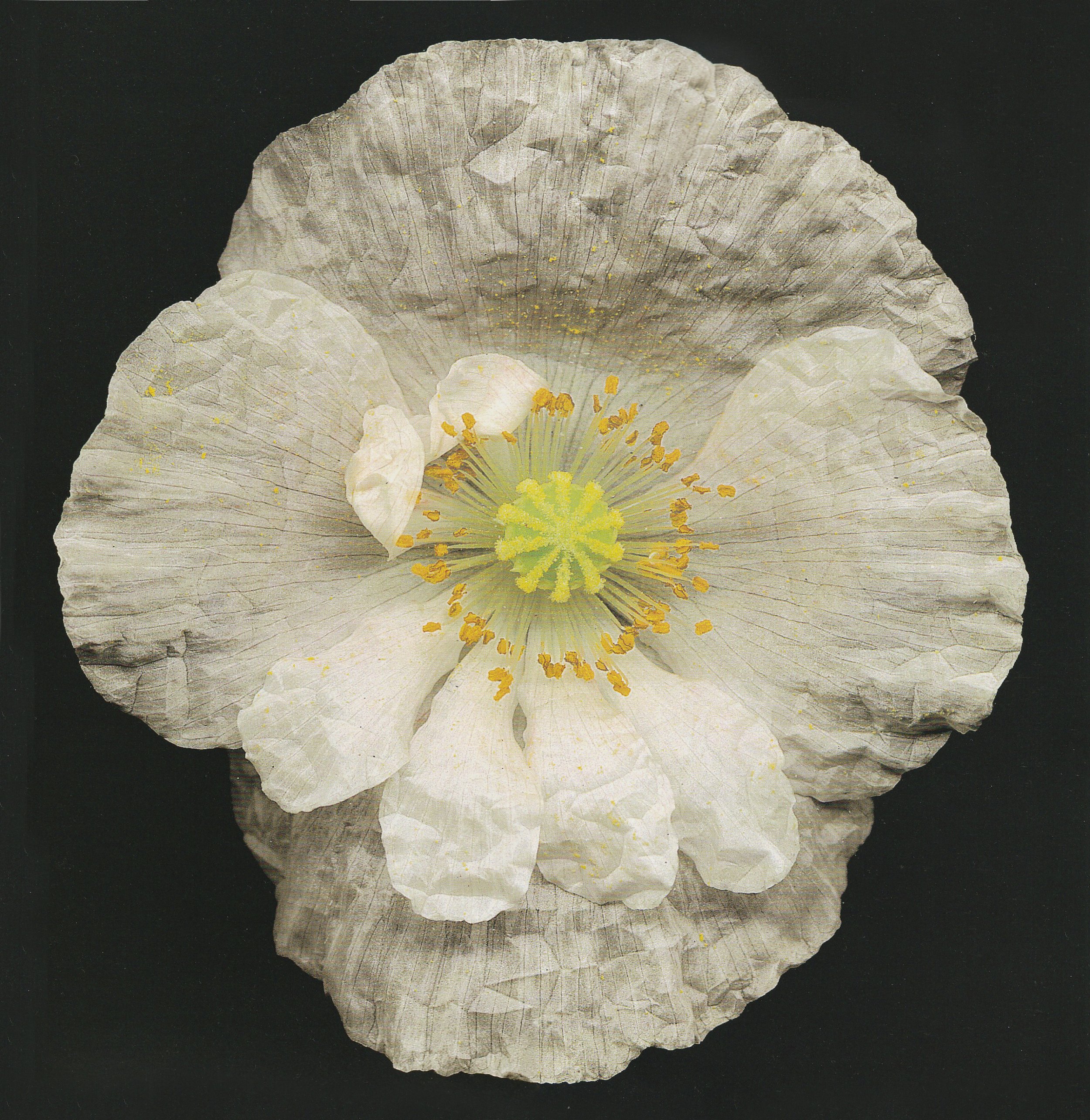
Poppy - Papaver species. Harold Feinstein - ‘One Hundred Flowers’

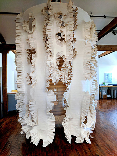
I have a tentative name for my next series: “Poppies”. It won’t last for long but for now, it inspires a sensibility I’m excited to explore. I’m searching for a feeling of delicacy from the heavy tight-weave canvas I use. I want it to feel “as wispy as a cloud”. I know how to begin. I know in my first attempts, I’ll fail. But in a few weeks’ time, I’ll have found my vision—I’ll know how to achieve it and have several works underway.

I’ve tentatively scheduled to have this series completed by October, I can then have it photographed and begin sharing with you in early November. No promises, though I think it’s a reasonable objective.

If you aren’t already receiving updates on my work and you would like to see how this is progressing, sign up here for email updates.
Toile edition

I have Jason Stein, Bonhams Director of Modern Decorative Art + Design, to thank for his suggestion that I make some work in editions. That was back in 2015 when he came to dinner at my studio. I don’t think he knows how important that advice was. He may not even remember he gave it.

I’ll acknowledge it here and now--thank you, Jason!

He said, there are always people who are going to want more accessible work. Even then, I was making work on the larger side, and he advised too that my collectors would be looking for small pieces for smaller rooms. So, I set about creating work I could repeat, and make to order, up to 25 times. These are known as “editions of 25”. I decided they would be stretched taut on wooden stretcher bars, to be easy to handle and hang.

Over the years many of these editions have been made and are now in collections around the world. Maybe you have one yourself. Or, maybe right now, you’re thinking to stop reading this blog, to go check out the editions and choose one for yourself…but wait!

Mary Little with works from her Toile edition canvases

I have news of a new set of four editioned pieces named Toile, pronounced “twäl,” a version of a garment made by a designer to test a pattern. The etymology of this word is grounded in the world of fashion, usually referring to apparel. In Toile, I use canvas, similar to but heavier than the muslin used in the construction of these types of garments. Each new work is structured to express linear repetitions and has been refined through multiple iterations, just as a traditional garment toile.

My edition works are a means for me to explore how my palette of forms and use of repetition can be transformed and developed when the surfaces are stretched taut; rather than being allowed to hang and be shaped by their own surface tensions and the pull of gravity.

In this new set of editions, I’ve incorporated a combination of both the free-hanging layers and stretched forms in the works. I’ve extended the subtleties of proportion, form, and surface. They’re framed arrangements of soft imbalance and fluidity.

The first in the editions, Hume, looks back to Bradley, from my Double series, with its double layers sewn into each other. There is a smoothness and steadiness to the work, more so than in Bradley, due to the structured frame. From the front, it looks almost like the lines in a notebook, the second layer creating shadows beneath each row to add depth and dimension. The rows jutting out are even but crease as they wish, and the softness is made stronger by the volume and repetition of layers, drawing your eye to the center.⁠

Mary Little - detail of 'Hume' canvas from her Toile edition

Hume - detail - unbleached cotton canvas on wood stretcher frame 36”h x 36”w 3”d 91cm x 91cm x 8cm

Fitt comes from Gransha and Ballycastle, both of my Moss series, taking the pattern found in both and reworking it in a way that enhances the feeling of being balanced and refined. While this pattern typically creates a rippled effect on the canvas, when it’s pulled taut on the frame, it becomes a contained, quiet arrangement. ⁠Fitt feels more delicate than the other Toile editions.

Mary Little - detail of 'Fitt' canvas from her Toile edition

Fitt - detail - unbleached cotton canvas on wood stretcher frame 32”h x 32”w 2”d 81cm x 81cm x 5cm

The third in the editions is Trimble, coming originally from Munn of my previous Ennis series, as well as Warnock from my Double series. When I first began using this pattern, I took a wabi-sabi approach, allowing the pleats to crinkle wherever they wanted. I’ve done the same here in Trimble. This second layer lifts from the taut canvas beneath, it feels large and orderly, with its wide horizontal pleats arranged into three even pillowed columns.

Mary Little - detail of 'Trimble' canvas from her Toile edition

Trimble - detail - unbleached cotton canvas on wood stretcher frame 36”h x 36”w 3”d 91cm x 91cm x 8cm

Sands was not named after a landscape, but still evokes thoughts of tiny marks in the sand along the shore, showing the path of a bird or crab. Its lineage is from Flanagan of the Ennis series, except here I’ve turned the pattern vertically and sewn it into the tautly pulled canvas layer. While the pattern is even, the overall arrangement of Sands is asymmetrical, with the left margin holding greater space than the right. It’s almost a book spine for the story that writes itself over the work in precisely spaced columns and rows.⁠

Sands - detail - unbleached cotton canvas on wood stretcher frame 48”h x 36”w 2”d 122cm x 91cm x 5cm

Enough of words! Now is a good time to see what each canvas looks like. Here in Numbered Editions are multiple views of each work, along with dimensions and current prices, so you can see if there is a Toile piece that could be a good fit.

Email me if you would like to know more.

Double Down

What I love most about my latest series, Double, is that it’s so distinct from much of my prior work, and yet still builds on what came before it. Sometimes new concepts arise from the smallest details, much like the threads that run through my work. If you look closely, you can observe just how I take a particular technique and transform it. 

Rosetta, Unearth series - detail

The concept for my latest series, Double, really began with Rosetta, from my Unearth series in 2020. Before Rosetta, I hadn’t attempted to incorporate another layer of canvas into my works. The first iteration of a concept is usually more subdued than what comes after it, and you’ll notice that in Rosetta. I kept the piece quite simple, focusing mainly on texture.

Alexander, Lineage series - detail

I didn’t revisit the idea of using more than one layer of canvas until Alexander, from my Lineage series in 2022. If you’ll remember last spring, Alexander was one of the most popular pieces from Lineage, and those who attended the opening lingered a little longer near it, too. 

While I wasn’t referring back to Rosetta directly when making Alexander, something about Rosetta stood out to me, and I knew I wasn't finished exploring it yet. In Alexander, I took the layers and began exploring more with the shapes I could create from the patterns I used. The result was a piece that came staunchly away from the wall, jutting out at the bottom as if suspended by an invisible string. 

Bradley, Double series - detail

Warnock, Double series - detail

And so, last summer, I felt drawn to adventure into the possibilities of expansion that might arise by layering the canvas. More than texture or pattern, I wanted my Double series to exude abundance, to be large and voluminous. It’s fun to see what came of this experiment now, and how the reliefs morphed in various directions as I went along. 

Maura, Double series

In addition, I didn’t want to constrain myself to a singular theme but allow myself time to let the works develop. Releasing the works one by one gave me a deep sense of freedom. As an artist, I never know just what I’ll discover with each series and how it will all come together. There were several moments throughout the creation of Double where I paused to reflect on its direction and there were even more moments when I forged ahead and found myself trying something new. For instance, I didn’t expect to sew the layers into each other originally, but that’s exactly what happened with Warnock, and then later with Bradley. 

Adair, Double series

If you’d like to hear more of the story behind Double, come by the studio. I’m always happy to talk about and show you my work–there’s something special about doing so simultaneously. Email me and tell me when you’d like to visit.

You can see more of my Double series here.

My need for a new work space

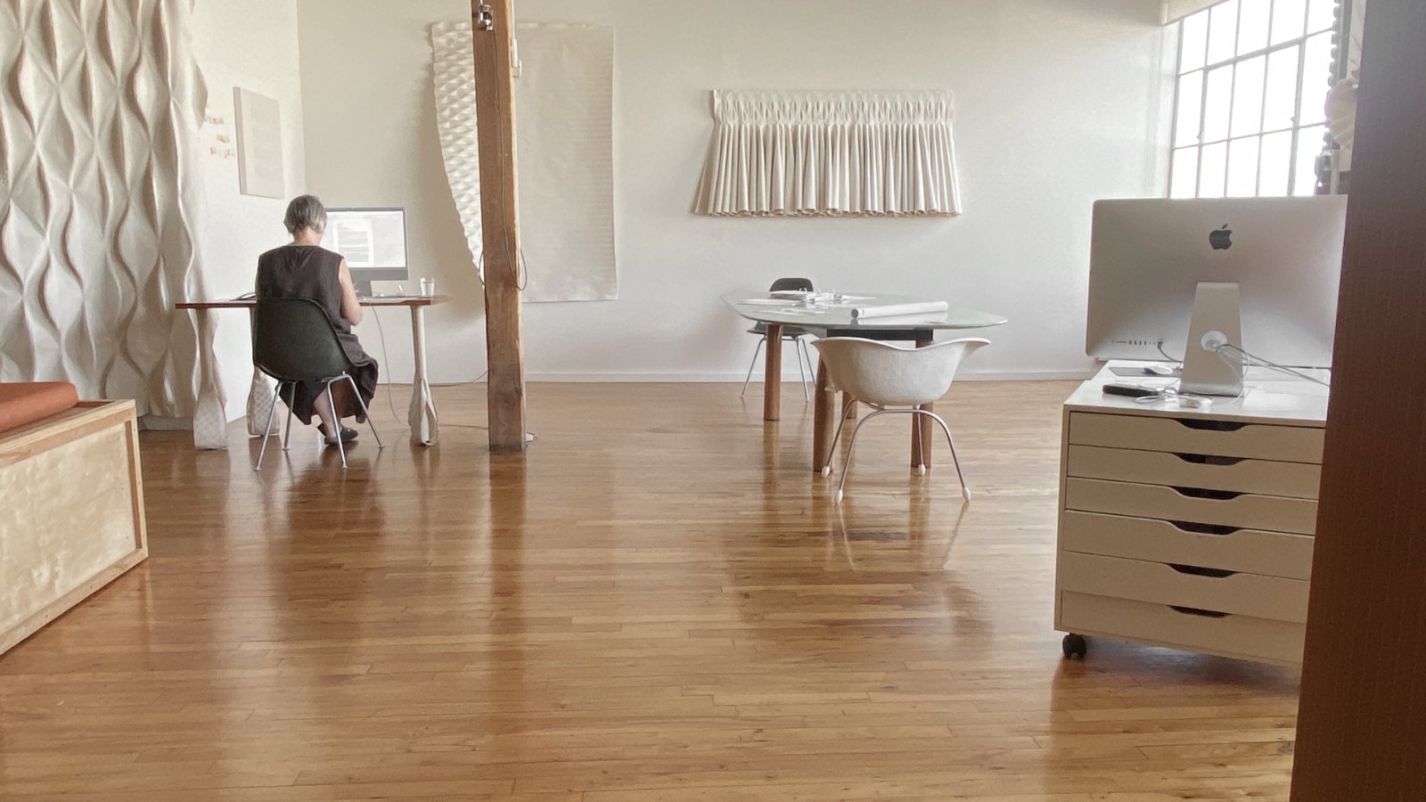
When it came time for me to find a new studio, my primary intention was to create a quiet space where I could be creative and work in peace. I wanted to have the space to spread my work out and have a place for every step of the process–a sewing table, layout table, cutting table, walls for visual research, and in-progress pieces. And, at the same time, I wanted a space I could share with all of you; a place for studio visits to show my finished work and current projects. 

My cutting table in my Bendix Building studio

My studio at the Bendix Building offers all of this quite easily. It’s like a blank canvas for me to work within, with its spacious ceilings, long white walls, and row of windows at the end–not unlike the material I work with directly. I feel as though I can focus here, without distraction. The only thing before me is my work: my materials and my tools. It’s freeing to have a space solely dedicated to my practice, and none of the behind-the-scenes tasks. 

Artist Mary Little working in her 1250 Long Beach Ave.  studio/gallery

Writing at Long Beach Ave. studio

Those are left to my original studio, at Long Beach Avenue. This is where the business side of my practice is stationed–all the planning and managing of clients, sales, creation of marketing materials like web design, graphic design and editing photography, and copywriting. It’s here that the packing and shipping of artwork happens, as well as bookkeeping, technology needs, and any research. Sometimes I might entertain clients in this space, to show selected works. It’s a cozier space, with its wooden floors and painted green walls. Everything feels enclosed here, contained, which somehow makes it easier to manage all the administrative tasks.

Since the addition of my work studio, I feel as though my practice has expanded in ways I hadn’t anticipated. New ideas are more fruitful, and I am less inhibited about experimenting. The separation of the two distinct parts of my practice is allowing me the room to explore while also keeping me more organized. I’m grateful for the privilege at this point in my career to create a workflow that best suits me.

I enjoy showing visitors what I’m working on and for them to see my finished works. I’m inviting you to visit. Which studio would you like to see, or would you like to see both? Email me.

Are You Thinking Big?

When you’re sourcing art for clients I aim to make reviewing the art on my website as easy as can be. Many of you now add my work to client proposals without even contacting me in advance because you can access images, dimensions and prices from my Resources page WITH EASE. 

Did you know I also do commissions?

"Ards" commissioned for the Monarch Beach Resort in Dana Point, CA by art advisor Anne Mennealy and Danielle Fox from Rodrigo Vargas Design.

"Ards" commissioned for the Monarch Beach Resort in Dana Point, CA by art advisor Anne Mennealy and Danielle Fox from Rodrigo Vargas Design.

Commissions usually begin with a client’s interest in one or two of my works with the hopes of acquiring something in a specific size.  The resources page is usually the jumping off point for this process. When I'm brought into the discussion, I like to ask a few questions: where it will hang, what direction is the sunlight, is it art the client will sit in the room with to enjoy, or a work they will pass in a hallway. All this and more helps me begin to form a concept proposal for a new piece. 

Right now, I'm telling anyone who'll listen that I'm looking for an opportunity to create large installations for hospitality or public spaces - imagine a 20-30 foot high version of one of my canvases! 

Do you have any clients looking for large artworks, or something of a specific size? I encourage you to get in touch - let's talk!

As always, you can follow my studio practice @marylittlestudio.

My Collaborators: Light and Gravity

As I mull over ways to expand my practice and create new work, I can't help but revisit the reason I love the material I use. The unbleached artist canvas gives me freedom to explore a wealth of ideas. It's a literal blank surface on which light and gravity act as my close collaborators in affecting how each work is experienced. 

My Studio Doors are Open!

Recently I sat down to create new work and am in this nice period where I have lots of ideas and am starting to sift through them. So, even though I'm busy in the studio, the subject line is true - my doors are open.  

Scheduling a visit can be as easy as replying to this email. A visit would be the best way to see works in progress.

In the meantime, here are a couple of pieces from the Inch Series currently hanging in my studio - added incentive to stop by! 

Portavogie, 60h x 40w ins

Portavogie, 60h x 40w ins

Islandmagee, triptych, 40h x 110w ins

Islandmagee, triptych, 40h x 110w ins

Talks and Workshops:
In October, I took a trip to Montreal to give an artist talk
at the Interior Design Magazine's Hospitality Giants Summit. 

I also gave a workshop in connection with my solo exhibition at Craft in America
titled Turning your Arts Practice Into a Sustaining Business. 

Photography by Nadia Zheng

Photography by Nadia Zheng

Exhibitions:
My work is on view in the exhibition London Calling 
at the MUSÉE DE LA CIVILISATION in Quebec  until March 9, 2019.

If you're in San Francisco, Nancy Toomey Fine Art at Minnesota Street Projects 
has some of my work.
You can contact Nancy to see it in person.

Recent Press:
Jenn Thornton recently wrote a lovely profile on me for
DIGS Magazine, Mary Little A New Approach to a Humble Material

If this is all brand new information, it's probably because you aren't following me on Instagram! It's a great way to see what is happening in my studio. Or you can take a look at my Resources page to see all the work in the Inch Series! Email me for the password. 

Tell Me What You See

In Los Angeles I live an urban life on the outer edge of downtown L.A. where it's warm and dry and, even though we're in the first days of November, my windows are wide open. There is a lot of activity on the street that I can hear as I write this from my 3rd story loft.

To retreat I return to the low hills and the tiny islands of Ireland worn into appealing gentle forms over millennia of exposure to rain and ice. With the Inch series I've created an interior environment that brings these soft forms with their gentle presence to my mind and heart. 

Donagadee, 60h x 40w ins.

Donagadee, 60h x 40w ins.

Islandmagee Triptych, 40h x 110w ins.

Islandmagee Triptych, 40h x 110w ins.

To one collector Donagadee - above, brought to mind a pregnant female form. To another, the Islandmagee tryptic in the series is so surreal that she believes aliens are ready to crack out of those eggs. Whereas, to me, they bring to mind burial mounds.

Ripeness, pregnancy and anticipation seem to be present in many visitors’ minds when they’re in the presence of this work. What do you see when you look at them? 

Healey, 75h x 50w ins.

Healey, 75h x 50w ins.

Big! Going Big!

Back in 2015, Angus was the first wall piece I created. It was the catalyst for shifting my focus away from sculptural furniture to the work you are now familiar with. Since then, I’ve created three other large-scale installations. First, there was Strangford, made for an exhibition at Google L.A.’s campus taking advantage of a 20’ high wall. Emboldened by the size, I created Inishowen, a work that would command attention for the San Francisco Fall Art & Antiques show. Inishowen is an environment large enough to sit inside to read, relax or for contemplation. Most recently, I created a smaller installation, Neagh, for my solo exhibition at Craft in America, which hopefully you had the opportunity to see before it closed back in June!
 
These pieces would create a place of peaceful serenity in which ever space they were installed.

Angus, 120" x 120”

Angus, 120" x 120”

Inishowen, 144" x 92" diameter

Inishowen, 144" x 92" diameter

Strangford triptych, 120" x 120"

Strangford triptych, 120" x 120"

Pattern within Pattern

The title says it all…as you can see Marian and Betty both contain multiple patterns within one work. With these canvases I was inspired by the complex patterns found in Aran sweaters that my mother Betty knit all through my childhood. It’s the relief that appeals and the relationship between the repeating motifs in different scales, that fascinate me. Marian and Betty are from my Aran Series and are the result of my reflections on pattern and relationships.

Marian, 64" x 60" [Aran Series]

Marian, 64" x 60" [Aran Series]

Betty, 64" x 68" [Aran Series]

Betty, 64" x 68" [Aran Series]

Boundaries in Art

Over the summer, when it typically goes quiet, I plan to focus on completing a new series. As part of the process I like to review ideas I’ve already created. In both these works below I’ve explored boundaries. 


O’Halloran has a smooth neutral interior - a space of rest bounded by rolling edges. Whereas Marley’s flat border frames its central undulating ridges. As an artist, it’s important to consider how a viewer might “read” my work and how their eyes might slowly explore the central core and its borders.

O’Halloran, 60” x 24”   [Ennis Series]

O’Halloran, 60” x 24” [Ennis Series]

Marley 62” x 42”  [Drumlin Series]

Marley 62” x 42” [Drumlin Series]

The Long and the Short of it

A square format is my favorite. It has a tranquil proportion.  Though a proportion with a little dramatic is sometimes called for. 

With Johnson and MacEoin I imagined what it might be like to run my fingers, instead of my eyes, over the surface – to think of the tactile instead of visual. Would it be like running my fingers over piano keys or a xylophone?

Johnston, 27" x 110"  [Drumlins Series]

Johnston, 27" x 110" [Drumlins Series]

MacEoin, 63" x 19" Available at Hammer & Spear

MacEoin, 63" x 19"
Available at Hammer & Spear

There’s Scale Then There’s Scale

There’s a calmness and beauty to be found in repetition. While not truly understanding how she did it, I have admired Agnes Martin’s ability to make strong works with small changes of scale, density, proportion - working within a narrow vocabulary. When I was a younger artist “you don’t need to reinvent the wheel with every project” was a common refrain from creative friends who watched the struggles I put myself through. Now I am beginning to understand how calm and beauty can be drawn out while still working within a tight framework.

Munn, 60” x 60”  [Ennis Series]

Munn, 60” x 60” [Ennis Series]

Flanagan, 60" x 60"  [Ennis Series]

Flanagan, 60" x 60" [Ennis Series]

Sian Morgan, 60” x 60”  [Ennis Series]

Sian Morgan, 60” x 60” [Ennis Series]

Square. Both Square.

I’ve created over 25 square works in the last 3 years. 

Anne Jane, 60" x 60"  [Aran Series]

Anne Jane, 60" x 60" [Aran Series]

Henderson, 42" x 42",  [Valley Edition, Edition of 25]

Henderson, 42" x 42", [Valley Edition, Edition of 25]

My excitement comes from finding a new character in each.

Anne Jane and Henderson come out of distinctly different approaches - the former is loose and expansive, doing its own thing using cloth in abundance. And the latter is stretched taut with highly controlled mark making. One is 60” square and the other 42”. Anne Jane references clothing, while Henderson is inspired by ploughed fields. Their common characteristics are: square, off-white color, and areas of texture, contrasted by large flat surface. Polar opposites yet with so much in common.

Similar Yet So Different

Back in November 2017 a journalist made a visit to my downtown studio. In advance, I sent him a link to my website and an invitation to view the catalogues in the private Resources section. When he arrived he slowly walked around taking in the work, then asked: may I give you some advice? I LOVE advice, so of course I said, “yes!”. He said that he’d started seeing my work in homes in Beverly Hills and Bel Air, and heard my name pop up when in the company of designers and collectors. But the general feeling was, WHO is Mary Little? Who represents her? Does she take commissions…?

His advice: “You have to up your game!”.

So, based on this I’ve developed a pretty bold strategy for 2018, to be more visible and accessible in Los Angeles and the west coast. While I work on this - it takes planning and collaborations – I continue to invite designers like you on studio visits. Everyone says the work comes alive in reality. Would you like to come to see what I have hanging now, and see work in progress? You could come alone, or with a colleague or client. I have parking and we could even do lunch or afternoon tea…

Would you like to check your schedule and see if you could take a break on Wednesday, 1/31 or Thursday, 2/1. I’ll be working here at the studio both days, and we usually have a delicious homemade soup around noon.

In the meantime, enjoy these three artworks which though similar, are in their individual ways distinctly different.

O'Conner, 44” x 44”  [Ennis Series]

O'Conner, 44” x 44” [Ennis Series]

Bush, 54” x 34”  [Ennis Series]

Bush, 54” x 34” [Ennis Series]

Dunleath, 24” x 24”  [Ennis Edition, Edition of 25]

Dunleath, 24” x 24” [Ennis Edition, Edition of 25]